
A converting HVAC landing page does three things inside the first three seconds: it answers the exact search intent that brought someone there, it puts one obvious action in front of them (call or a short form, never both fighting for attention), and it proves you're a real, trustworthy company before they scroll past the fold. Miss any of those three and you're paying for clicks that bounce.
Here's the one-screen checklist to run any HVAC landing page against, whether you're briefing a designer or grading a page you already have live:
- Service + location specificity in the headline (not "HVAC Services" but "AC Repair in Round Rock, TX")
- Click-to-call that's tappable, not just visible, on mobile
- One CTA, prioritized by intent (emergency = call, planned = form or quote)
- A trust signal above the fold: a review count, a certification badge, years in business
- A single offer, not three competing ones (repair discount, maintenance plan, or install financing, pick one)
- Sub-2.5-second mobile load time
That last number isn't arbitrary. HubSpot's research on page load time shows conversion rates drop measurably with every additional second of load delay, and mobile-specific benchmarks from Astra Results put sub-2.5-second load squarely at the center of HVAC conversion lift. Leapify Media builds landing-page infrastructure around exactly this checklist because it's the difference between an ad budget that produces booked jobs and one that produces expensive traffic.
Key Takeaways
A converting HVAC landing page matches search intent within seconds, prioritizes one CTA tied to that intent, and loads in under 2.5 seconds on mobile.
| Point | Details |
|---|---|
| Match CTA to intent | Emergency searches need click-to-call; planned-service searches can use a short form with pricing cues. |
| Split emergency and planned pages | Don't run one generic page for both intent types; each needs its own structure and trust signals. |
| Hit the mobile speed target | Aim for sub-2.5-second load, since a large majority of HVAC searches happen on mobile devices. |
| Test before you redesign | Run CTA type, headline, sticky call bar, and form-length tests before committing to a full rebuild. |
| Consider an integrated build | Leapify Media pairs landing-page CRO with AI-driven lead dispatch and CRM wiring so leads get routed and answered, not lost. |
Table of Contents
- What Makes a Great HVAC Landing Page? Annotated Examples
- What Sections Does a High-Converting HVAC Landing Page Need?
- Why Does Mobile Design Matter So Much for HVAC Pages?
- Where Can You Find HVAC Landing Page Templates and Builders?
- How Much Does an HVAC Landing Page Cost to Build?
- Which A/B Tests Should You Run First?
- What Happens When You Fix These Elements? A Real Case Example
- If You Can Only Fix Three Things This Week, Fix These
- How Leapify Media Builds Landing Pages That Convert
- Sources
What Makes a Great HVAC Landing Page? Annotated Examples
The fastest way to learn what works is to look at pages that already do it, then steal the structure, not the words. Design galleries like Dribbble's HVAC landing page collection and Figma community files are full of concepts worth studying, even if they're mockups rather than live, tested pages. Here's what separates the ones that would convert from the ones that just look nice.
Emergency repair page, single-CTA hero. The best emergency pages skip the marketing copy entirely. Headline reads "No Heat? We're Open 24/7 in [City]" with a phone number in 40-point type and a secondary line confirming same-day availability. What works: zero friction between landing and calling. The opportunity: several examples in the Dribbble tag collection bury the phone number below a hero image instead of overlaying it, which costs taps on mobile.
Maintenance plan page with pricing anchor. Planned-service visitors research more before they act, so a page showing three maintenance tiers with monthly pricing performs differently than an emergency page ever should. What works: pricing transparency removes the "I need to call and ask" barrier that stalls conversions. The opportunity: some versions cram the plan comparison into a dense table that's unreadable on a phone screen, forcing horizontal scroll.
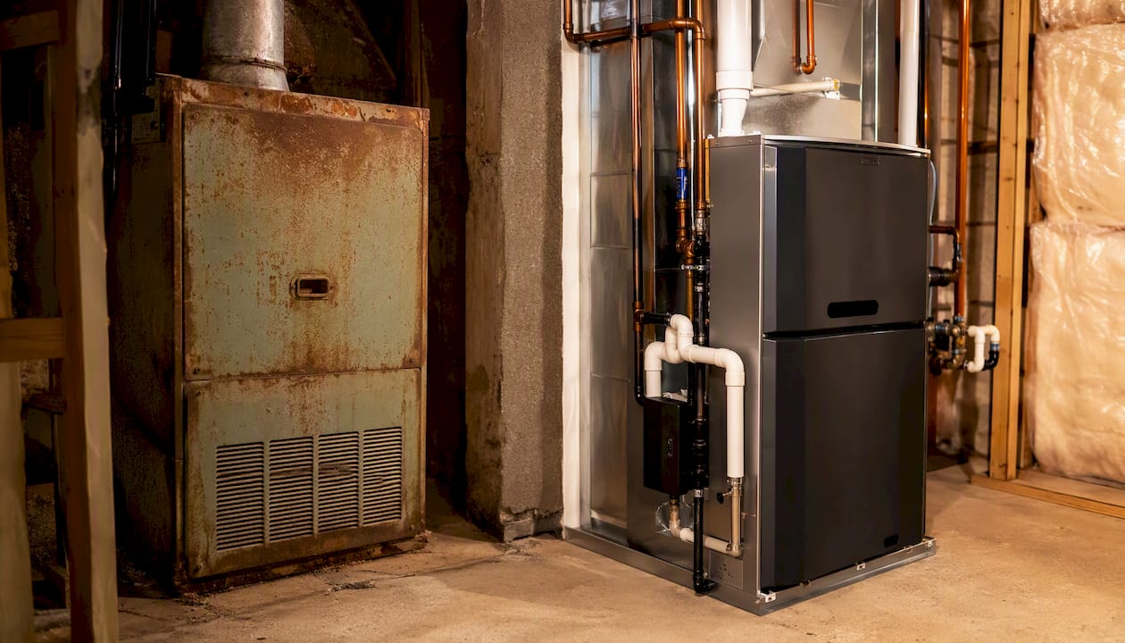
Installation/financing page with before-and-after visuals. New system installs are a bigger purchase decision, so pages that pair a photo of an old, failing unit next to a new install (with a financing callout beneath) do real psychological work. What works: the visual contrast does the selling before the copy even starts. The opportunity: a few examples load these images unoptimized at full resolution, tanking load speed exactly where it matters most.
Seasonal tune-up page with urgency framing. "Book Your Spring AC Tune-Up Before the Heat Hits" style pages lean on a limited-window offer. What works: urgency without being pushy, paired with a simple one-field form (name + phone, nothing more). The opportunity: some versions still ask for six fields, which is where form abandonment creeps in.
Commercial HVAC service page with logo trust bar. B2B-facing HVAC pages that show recognizable client logos or property-management partnerships build credibility fast. What works: the logo bar sits directly under the hero, not buried at the bottom. The opportunity: text-heavy service descriptions that read like a brochure instead of stating the scope plainly.
The split between emergency and planned-service visitors isn't cosmetic. Emergency visitors want a phone number and proof someone will actually answer; planned-service visitors want pricing cues, financing information, and enough detail to feel confident before they commit. A single page trying to serve both intents usually serves neither well.
That distinction from Lost and Found Marketing's research on HVAC landing page design is probably the single most under-applied lesson in the category. Most HVAC companies run one page for every campaign. The ones that split emergency and planned-service traffic into separate page structures consistently see better message match.
What Sections Does a High-Converting HVAC Landing Page Need?
Structure comes before copy. Get the anatomy right and even average writing converts. Get it wrong and great copywriting can't save a confusing layout.
It needs the service named specifically, the location named specifically, one clear benefit, a visible trust signal, and a CTA that matches intent. Nexora Creation's research on home-service landing pages found that pages matching the ad's exact service, location, and offer convert meaningfully better than a generic homepage sent the same traffic. If your Google Ad says "AC Repair Round Rock," your headline needs to say "AC Repair Round Rock," not "Your Comfort Experts."
Midpage, build in this order:
- Problem framing — one line acknowledging the pain (no heat, no cool, strange noise, rising bills)
- Benefits — what the customer gets, stated as outcomes, not features ("same-day fix" beats "24 years of experience")
- Services list — clearly scoped: repair, maintenance, installation, emergency, so visitors self-identify fast
- How it works — three steps max (call or book, technician arrives, problem solved)
- Pricing or offer — even a range or a "starting at" figure reduces hesitation
- Contextual reviews — pulled from the specific service mentioned in the hero, not generic praise
- Service area — named neighborhoods or towns, not just a county name
- Final CTA — repeat the same action from the hero, don't introduce a new one
For headline and CTA psychology, neuromarketing principles around clarity and urgency cues apply directly here. A headline like "Same-Day AC Repair, Round Rock" outperforms "Quality HVAC Service You Can Trust" because it is concrete and time-bound, not aspirational. Microcopy prompts worth testing:
- Headline: "[Service] in [City], Fixed Today"
- Subheadline: "Licensed technicians, upfront pricing, no overtime charges"
- CTA button: "Call Now, We Answer 24/7" instead of "Contact Us"
- Trust snippet: "4.8 stars from 340+ [City] homeowners"
Image guidance matters more than most HVAC sites treat it. Use real technician photos in branded uniforms, not stock photos of generic tools. Before-and-after shots of old versus new units work well on install pages. Alt text should describe the actual service ("technician repairing outdoor AC condenser unit") both for accessibility and because it reinforces the page's topic for search engines.
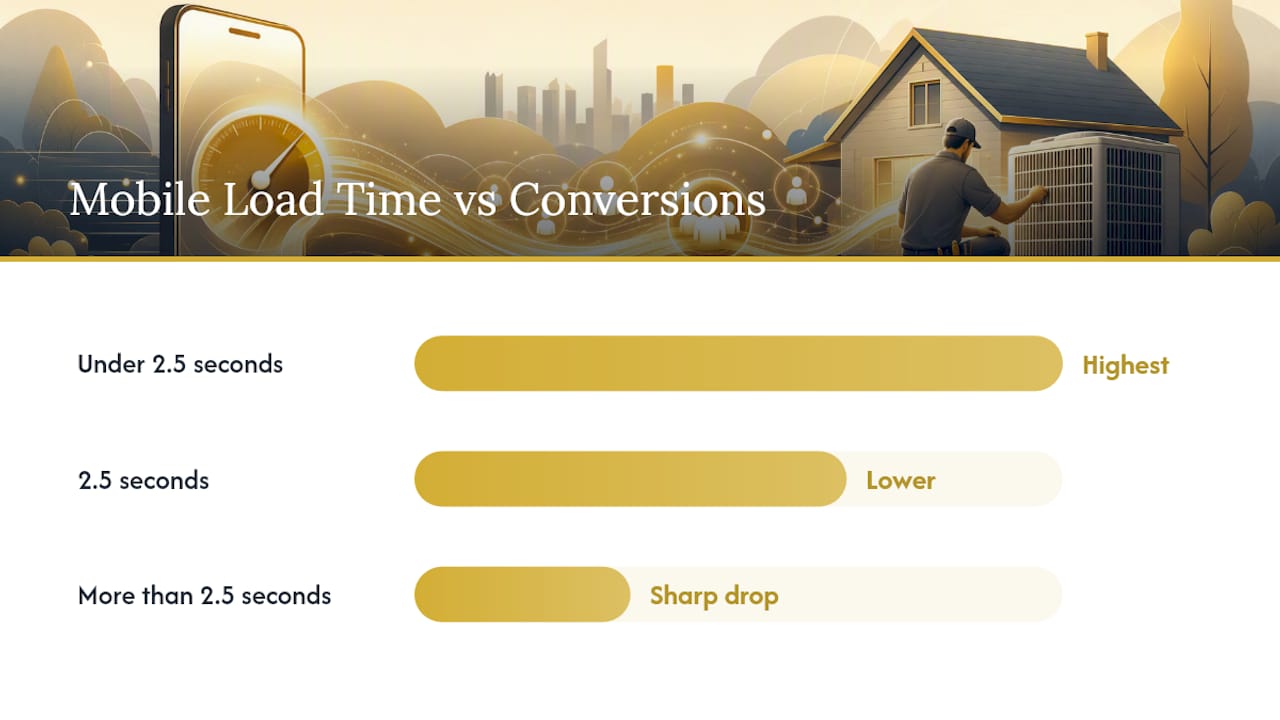
Here's what the load-time data actually looks like when you connect it to conversion outcomes:
| Load Time (Mobile) | Typical Conversion Rate | Notes |
|---|---|---|
| Under 2.5 seconds | Highest range observed | Meets the benchmark tied to strongest HVAC conversion performance |
| 2.5 seconds | Noticeably lower | Still functional but losing visitors to impatience |
| More than 2.5 seconds | Sharp drop-off | Web Tonic's HVAC landing page statistics show steep declines past this threshold |
Dedicated service pages built around one offer can reach conversion rates in the 12 to 22% range, according to Web Tonic's data, versus 3 to 6% for traffic dumped on a generic homepage. That gap alone justifies building separate landing pages for each campaign instead of running everything through your main site.
Why Does Mobile Design Matter So Much for HVAC Pages?
Between 70% and 78% of HVAC searches happen on mobile, according to Astra Results, which means most HVAC landing pages are being designed for the wrong screen if desktop gets the first draft. A page that looks sharp on a 27-inch monitor and cramped on a phone is failing the majority of its own traffic.
Follow these rules when adapting a design for mobile:
- Keep a sticky call bar visible at all times. A persistent tap-to-call button pinned to the bottom of the screen removes the need to scroll back up to find your number. Sticky call bars have been linked to conversion lifts of 20 to 40% on mobile in HVAC-specific CRO studies.
- Make tap targets big enough for a thumb. Phone buttons and form fields need real touch area, not a tiny hyperlink sized for a mouse cursor.
- Cut form fields to the minimum. Name and phone number is often enough. Every extra field is a chance for someone to close the tab instead.
- Break up text into short blocks. A wall of paragraph text that reads fine on desktop becomes an endless scroll on mobile. Use short lines and generous white space.
- Stack content in a single column. Side-by-side layouts that work on desktop often collapse awkwardly on mobile if they weren't designed mobile-first from the start.
Performance work matters just as much as layout. Load only what's visible above the fold first, defer everything else, and load images lazily as the visitor scrolls. Inlining critical CSS for the hero section (rather than waiting on an external stylesheet) is one of the more overlooked techniques for hitting that sub-2.5-second target, since it lets the browser paint the hero before the rest of the page's styling even downloads.
Pro Tip: Test your landing page on an actual mid-range Android phone over a 4G connection, not just your own iPhone on office Wi-Fi. That's closer to what a real homeowner searching "AC repair near me" in a hot garage is actually working with.
Where Can You Find HVAC Landing Page Templates and Builders?
You've got three real paths to a launched page: a fast template, a designer-led custom build, or a page-builder platform built for testing. Each fits a different budget and timeline.
- LandingPageFlow-style template builders are the fastest route to something live. Ease of use is high, speed to launch is measured in hours, and most include basic conversion features like click-to-call buttons and simple forms out of the box. The tradeoff is limited customization and a look that can feel templated if you don't adjust the copy and imagery.
- Figma is where designer-led builds start. Community files, like the components shared by designers such as VictorFlow on Figma, give you production-ready hero layouts and UI kits that shorten the handoff to a developer. It's not a builder you publish directly from, so you'll need development resources to turn the design into a live page.
- Dribbble functions as an inspiration and sourcing layer rather than a build tool. Browsing the HVAC landing page tag is useful for briefing a designer on hero concepts, color palettes, and layout patterns before any pixel gets placed.
- SwipePages and similar dedicated landing-page platforms sit between templates and full custom builds. They're built specifically for testing variants, come with mobile-responsive defaults, and usually integrate directly with ad platforms and common CRMs, which matters more than it sounds like once you're running multiple campaigns.
- Page personalization tools like ConvertFlow add a layer on top of any of the above, letting you dynamically swap headlines or offers based on the traffic source. G2 reviews of ConvertFlow are worth reading before committing, since personalization tools carry a learning curve that a simple landing page doesn't need.
Whichever path you choose, the integration step is where most HVAC companies lose leads without realizing it. A gorgeous landing page that dumps form submissions into an email inbox nobody checks on weekends is worse than no landing page at all. Wire the form or call-tracking number directly into your CRM automation so leads get routed and followed up on automatically, and connect your ad platform's conversion tracking before you spend a single dollar testing traffic.
How Much Does an HVAC Landing Page Cost to Build?
Budget and timeline scale together, and knowing which tier you're in before you start a conversation with a designer or agency saves everyone time.
Template-based quick launches are the cheapest and fastest option, typically ready within a few days once copy and images are supplied. You're paying mostly for setup and customization time rather than design from scratch.
Mid-range custom landing pages take longer, usually a couple of weeks, because they involve original design work, copywriting tailored to your specific services, and testing across devices before launch. This tier is where most established HVAC companies with real ad budgets should land.
Higher-end conversion engineering adds CRO experimentation and integration work on top of the build, things like AI-driven lead scoring, custom event tracking, and CRM automation wired directly into the page. Timelines here stretch across a full project cycle: discovery and offer definition, design and copywriting, development and performance optimization, quality assurance and tracking setup, then launch with a defined test window.
A few factors reliably push cost and timeline upward: custom CRM or ad-platform integrations, advanced CRO testing programs, original photo or video content production, and the extra development hours required to hit sub-2.5-second mobile load consistently. None of these are optional extras if you're serious about conversion, but they're worth budgeting for deliberately rather than discovering mid-project.
Which A/B Tests Should You Run First?
Not every test matters equally. Some moves the needle immediately; others are worth doing eventually but won't tell you much in week one. Run these in roughly this order:
- CTA type: call versus form. Split traffic and see whether a prominent phone number or a short form generates more completed conversions for your specific service and intent level.
- Hero headline variants. Test a specific, service-and-location headline against a more generic brand-focused one. The gap is usually larger than people expect.
- Sticky call bar presence. Add it to half your traffic and measure the mobile conversion difference directly.
- Form field count. Test a two-field form against a five-field version to quantify how much detail costs you in completions.
- Review placement. Move your trust signal from the bottom of the page to directly under the hero and measure the shift.
Track these metrics against every test: phone-call rate (via call tracking, not just form submissions), form completion rate, mobile bounce rate, Largest Contentful Paint (the technical measure behind that sub-2.5-second target), and cost per lead broken out by channel. Astra Results' benchmark data on HVAC cost per lead shows that channel quality and page quality compound each other, meaning a bad landing page inflates your CPL even on your best-performing ad channel.
Pro Tip: Give each test a real sample size and a defined end date before you start, not "until it feels done." Ending a test early because one variant looks like it's winning is the single most common way HVAC companies fool themselves with bad data.
What Happens When You Fix These Elements? A Real Case Example
A regional HVAC company came to Leapify Media running Google Ads traffic to a single homepage covering repair, maintenance, installation, and commercial service all on one page. Conversion was low despite decent ad spend and reasonable click-through rates. The problem wasn't the ads. It was that every visitor, regardless of intent, landed on the same generic page.
The fix started with splitting traffic into intent-specific landing pages: one for emergency repair with a single click-to-call CTA and a 24/7 availability trust signal, and a separate maintenance-plan page with pricing tiers and a short form. Both were rebuilt mobile-first with a sticky call bar and stripped-down above-the-fold content to hit sub-2.5-second load times. On the backend, Leapify Media's on-premise AI lead dispatch system scored and routed each incoming lead by urgency and service type in real time, instead of dropping everything into one shared inbox.
Splitting emergency and planned-service traffic into separate, purpose-built pages, then routing the resulting leads through an AI dispatch layer instead of a shared inbox, is the difference between a lead that gets called back in minutes and one that gets called back tomorrow, if at all.
Leapify Media has reported client results as high as a 20x return on ad spend when landing-page specificity and AI-driven lead routing are implemented together rather than as separate fixes. The process followed a repeatable loop: brief and discovery, template or custom build selection based on timeline, CRO testing on headline and CTA variants, AI dispatch integration for lead scoring, then a measurement window tracking call rate and CPL by channel. Realistic timelines for seeing meaningful ROI movement after this kind of rebuild typically run four to eight weeks, long enough for both traffic volume and test significance to catch up with the changes.
If You Can Only Fix Three Things This Week, Fix These
Most HVAC companies I look at have a landing page that's trying to do too much. If you've got limited time and need to prioritize, skip the redesign fantasy and fix these three things first.
Match your CTA to actual intent. If someone searched "AC not cooling" at 9 PM, they don't want a contact form promising a callback tomorrow. They want a phone number they can tap right now. Audit every campaign you're running and check whether the landing page CTA actually matches the urgency behind the search term that brought the visitor there. This is the single most common mismatch I see, and it's also the cheapest to fix, since it's often just a button swap, not a redesign.
Put trust and your phone number above the fold, together. Not a phone number buried in a footer. Not a review carousel three scrolls down. A visible number and one credibility signal, in the same visual space, before anyone has to scroll. This one change alone tends to move the needle more than most copywriting tweaks people obsess over.
Get your mobile load time under control before you touch anything else. With mobile carrying the vast majority of HVAC search traffic, a slow mobile page is quietly killing conversions on every other fix you make. Run your page through a speed test, find out what's actually loading before the hero renders, and cut it.
If you're handing this off to a designer or agency this week, give them exactly those three priorities in that order. Everything else, the pricing tables, the testimonial carousel, the animated icons, can wait until these three are solved.
How Leapify Media Builds Landing Pages That Convert
Leapify Media is the alternative to guessing your way through page tweaks and hoping traffic converts better next month. Where a template builder gives you a starting shape and a freelance designer gives you a one-time page, Leapify Media wires the entire system together: AI-driven lead dispatch that scores and routes calls and form fills the moment they come in, landing-page CRO built specifically around HVAC search intent, CRM automation that keeps leads from sitting unanswered, and ad campaign integration that keeps message match tight from click to conversion.
This kind of build makes the most sense when your traffic volume is solid but conversion isn't matching it, when you're juggling multiple service lines that all need separate intent-matched pages, or when you need lead routing that doesn't depend on someone checking an inbox after hours. Because Leapify Media runs on-premise AI infrastructure rather than routing your customer data through third-party tools, the lead scoring and dispatch logic stays proprietary to your business. If your current setup is leaving calls unanswered or leads unscored, take a look at the full landing-page and CRO services Leapify Media builds for home service companies and get a scope for your specific traffic and service mix.
Sources
The research behind this guide draws on a mix of conversion benchmarking, design galleries, and platform reviews worth revisiting as you build or test your own pages.
For readers comparing regional lead-generation partners, Cursor Cat Digital's Alberta lead-generation page is a useful example of how localized service pages get structured for a specific market. And if you're building out your broader marketing stack beyond the landing page itself, Leapify Media's guides on CRM automation and HVAC lead generation agencies are worth the next read.